
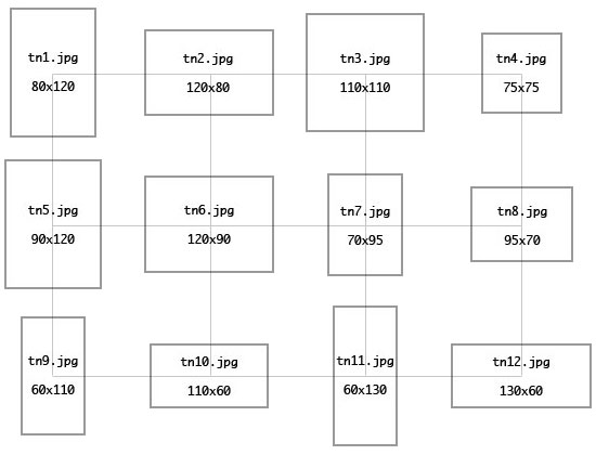
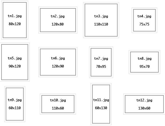
The image gallery with grid overlay demonstrating horizontal and vertical centering:
The code (explanation below):
Styling:
DIV.contact

	{
	display: inline-block;
	width: 140px;
	text-align: center;
	vertical-align: middle
	}
HTML:
<div style="width: 600px; line-height: 140px">
	<div class="contact"><img src="tn1.jpg"></div>
	<div class="contact"><img src="tn2.jpg"></div>
	<div class="contact"><img src="tn3.jpg"></div>
	<div class="contact"><img src="tn4.jpg"></div>
	<div class="contact"><img src="tn5.jpg"></div>
	<div class="contact"><img src="tn6.jpg"></div>
	<div class="contact"><img src="tn7.jpg"></div>
	<div class="contact"><img src="tn8.jpg"></div>
	<div class="contact"><img src="tn9.jpg"></div>
	<div class="contact"><img src="tn10.jpg"></div>
	<div class="contact"><img src="tn11.jpg"></div>
	<div class="contact"><img src="tn12.jpg"></div>
</div>
To understand how this method works, and why certain choices are made (particularly with regard to vertically "centering" the thumbnails), some insight into the general behavior of CSS is needed.
From its inception, CSS was primarily concerned with controlling the flow and styling of text, and it is easier to understand its often unintuitive or non-sensical behavior in this context. As the CSS specification has evolved, its methods and terminology often still cling to its text styling conventions. For instance, content as a whole (text, images or otherwise) has been somewhat shoehorned into CSS's text styling origins, which is why we use text-align to align text and...er...images and anything else. On a similar conceptual level, floating images or other content isn't so much about the position of that content; it is about how text (and other content now shoehorned into the text styling convention) flows around that content.
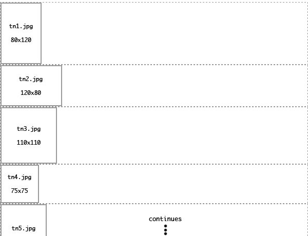
A line break is a text formatting term for deliberately ending a line of text and beginning a new line below it (as opposed to text simply "wrapping" to the next line). By default, all web browsers place a line break before and after a DIV (another example of the text styling convention being applied to content which now includes more than just text) and DIVs automatically expand to fill the entire width of the line they are on. Thus, even if a thumbnail image only occupies a small portion of the overall width of the gallery, its DIV container (dashed line) automatically expands to fill the remaining horizontal space, with the next image/DIV beginning below it; essentially one image per line.
The first step then is to define the "contact" DIV as part of the content within a line (a "block" element), rather than a whole line itself, allowing however many thumbnails/DIVs we can fit in a line:
display: inline-block; 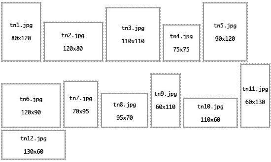
In order for all the images to be equally centered regardless of shape and size, a uniformly sized container is needed to center, which will encompass any thumbnail size/shape it may contain. Thus the width of the image containing DIV needs to be at least as wide as the widest image, and to avoid the edges of two particularly wide images side-by-side touching, the width should be oversized to provide some breathing room between images, should such a circumstance arise. The widest image used in this example is 130 pixels. An additional 10 pixels of breathing room will be provided for a total of 140px:
width: 140px; 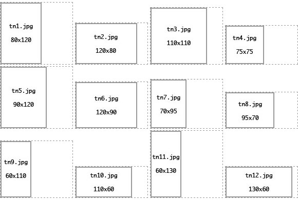
The greater challenge of devising a flexible, CSS centered thumbnail gallery arises from the widely varying and often unintuitive ways content is centered in CSS. For one, to center the DIV's content horizontally, we use the same property used to justify text:
text-align: center; 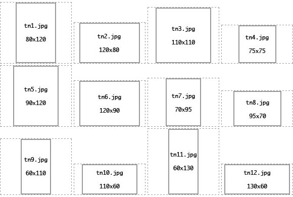
To the World Wide Web Consortium, text-align to center images makes sense.
To center the images vertically, we use the somewhat more intuitive:
vertical-align: middle; 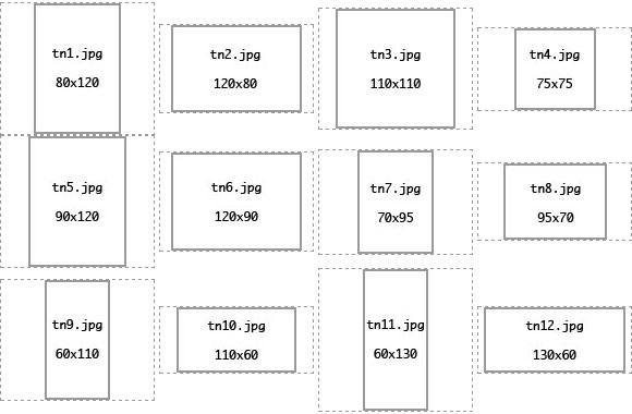
...which is only slightly confusing in that it actually makes some sense. However, while text-align sets the alignment of content within the DIV thumbnail container, vertical-align does not. Instead, vertical-align sets the alignment of the DIV thumbnail container itself within its container (the larger gallery DIV), in relation to other content on its line i.e. it is aligned vertically, relative to the other thumbnail DIV containers in its row. Note a height hasn't yet been set for the image containing DIV. This is because...it's behavior is confusing.
By leaving the thumbnail container DIV height unspecified, its height defaults to the height of the thumbnail it contains. Thus varying height thumbnails will have equally varying height DIV containers vertically-aligned with one another (or vertically "centered"), giving the impression the images themselves are "vertically centered" with one another, even though it is really the DIVs themselves which are vertically-aligned.
If a height were set for the thumbnail container DIV, all thumbnail container DIVs would be the same set height, and since vertical-align does not center their content, thumbnails which are not exactly the same height would not be centered in their containers.
There is one problem here though. Extra space was given to the width of each thumbnail container as breathing room, and since the height of the containers are exactly the same as the thumbnail height, somehow breathing room needs to be added to the height, so the gallery appears equally spaced both horizontally and vertically.
The answer is obscure, but simple after understanding the above explanation of CSS's tendency to style everything like it styles text. Text has a line-height or "leading" value, which is a fancy way of referring to the vertical spacing of text. A line-height equal to the font size would result in lines of text which barely touch one another, but a line height greater than the font size "spaces" the text out vertically.
Example 12px font
with 12px line-height
Example 12px font
with 24px line-height
Since the rows of DIVs containing thumbnail images are treated as "lines" by web browsers/CSS, we can simply set the line-height of the single large DIV which contains the smaller thumbnail DIVs to a height which keeps the thumbnails spaced vertically with the same breathing room set for the horizontal spacing. We do this as part of the actual HTML. The larger DIV containing the whole thumbnail gallery can be dimensioned and positioned wherever the designer wants it, but for this example it will be set with a width of 600px. Changing the width automatically redefines the number of columns/rows to fit.
<div style="width: 600px; line-height: 140px">
...
</div> 
Side note: This has an additional benefit. Some web browsers/rendering engines appear to figure the total height of the larger DIV containing the gallery as the sum total of the height of its "lines". If this were text only, it wouldn't be a problem as the line-height is usually slightly greater than the font size i.e. if a page has a 12px font with a line-height of 20px, then 10 "lines" would be 200px "high"; enough to "contain" the total height of the text. However, if images on each line have a height of 130px, 10 lines of images (or "rows" in the gallery) would have a total height of 1300px while the web browser/rendering engine "thinks" the height is still 200px. This can result in the display of the gallery being "cut off" (exhibited in Safari 5.1 and possibly Google Chrome, both WebKit browsers).
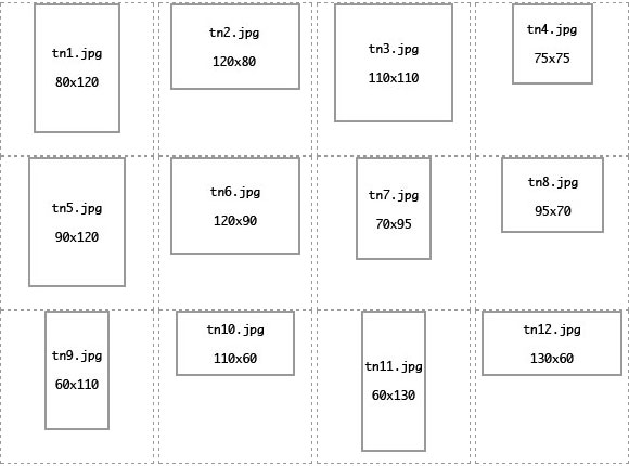
At this point, the last remaining step is to insert the following line in the main DIV, with the image name for each thumbnail.
<div class="contact"><img src="tn1.jpg"></div> ...which brings us back to the completed gallery:
<div style="width: 600px; line-height: 140px">
	<div class="contact"><img src="tn1.jpg"></div>
	<div class="contact"><img src="tn2.jpg"></div>
	<div class="contact"><img src="tn3.jpg"></div>
	<div class="contact"><img src="tn4.jpg"></div>
	<div class="contact"><img src="tn5.jpg"></div>
	<div class="contact"><img src="tn6.jpg"></div>
	<div class="contact"><img src="tn7.jpg"></div>
	<div class="contact"><img src="tn8.jpg"></div>
	<div class="contact"><img src="tn9.jpg"></div>
	<div class="contact"><img src="tn10.jpg"></div>
	<div class="contact"><img src="tn11.jpg"></div>
	<div class="contact"><img src="tn12.jpg"></div>
</div>
This is the basic framework for the thumbnail gallery. Within this, the individual thumbnails can be wrapped in anchor tags to link to the actual images, and/or styled to include a border, padding, etc.
DIV.contact IMG

	{
	padding: 4px;
	border-style: solid;
	border-color: #D9D9D9;
	border-width: 1px
} 
Click here to see the working thumbnail gallery page Click here to see the working thumbnail gallery page with 450px width Click here to see the working thumbnail gallery page with 750px width
(produces 4 columns)
(produces 3 columns)
(produces 5 columns)